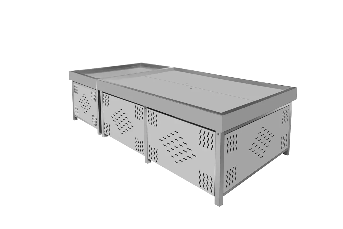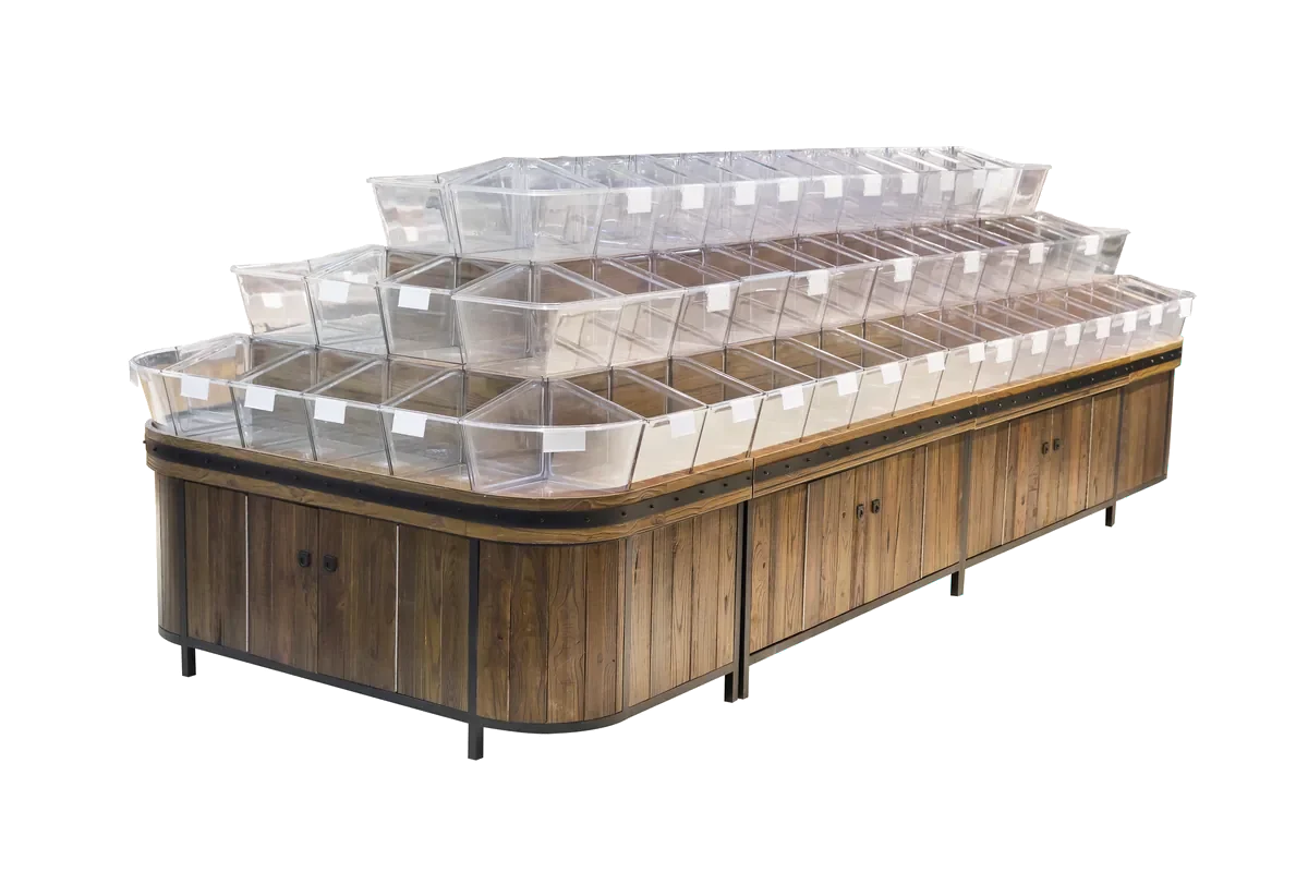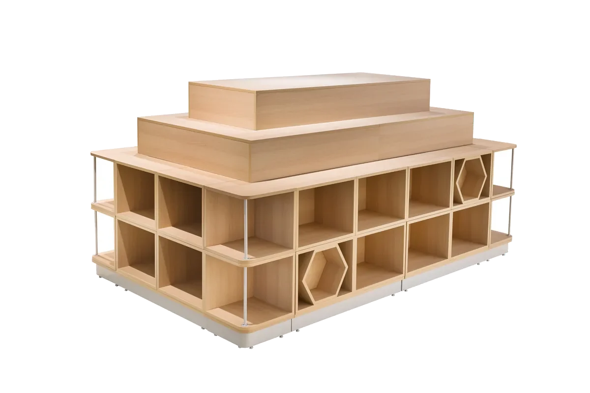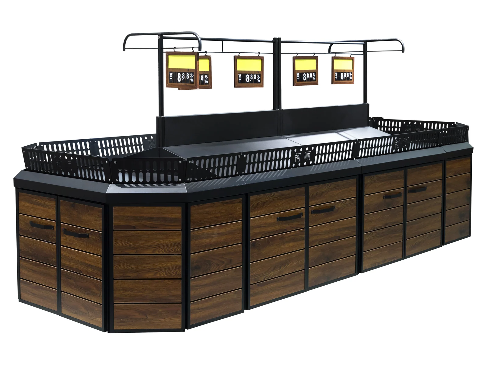




Rich Timber Grain
Paint-free wood grain board
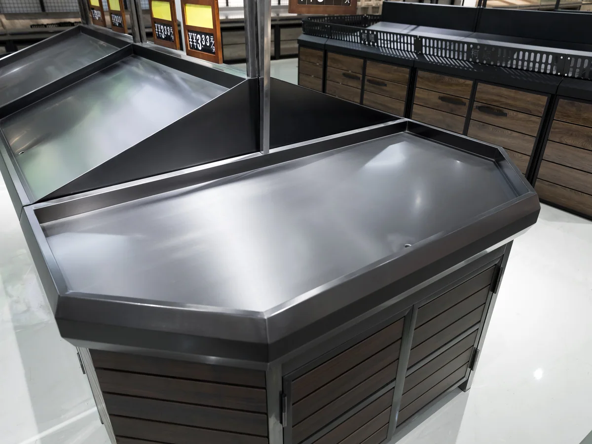
Paint-free wood grain board with the grain clearly visible. It is generally density board or multi-layer board, safe and environmentally sound, and it is the warmest tone we hold for this category.
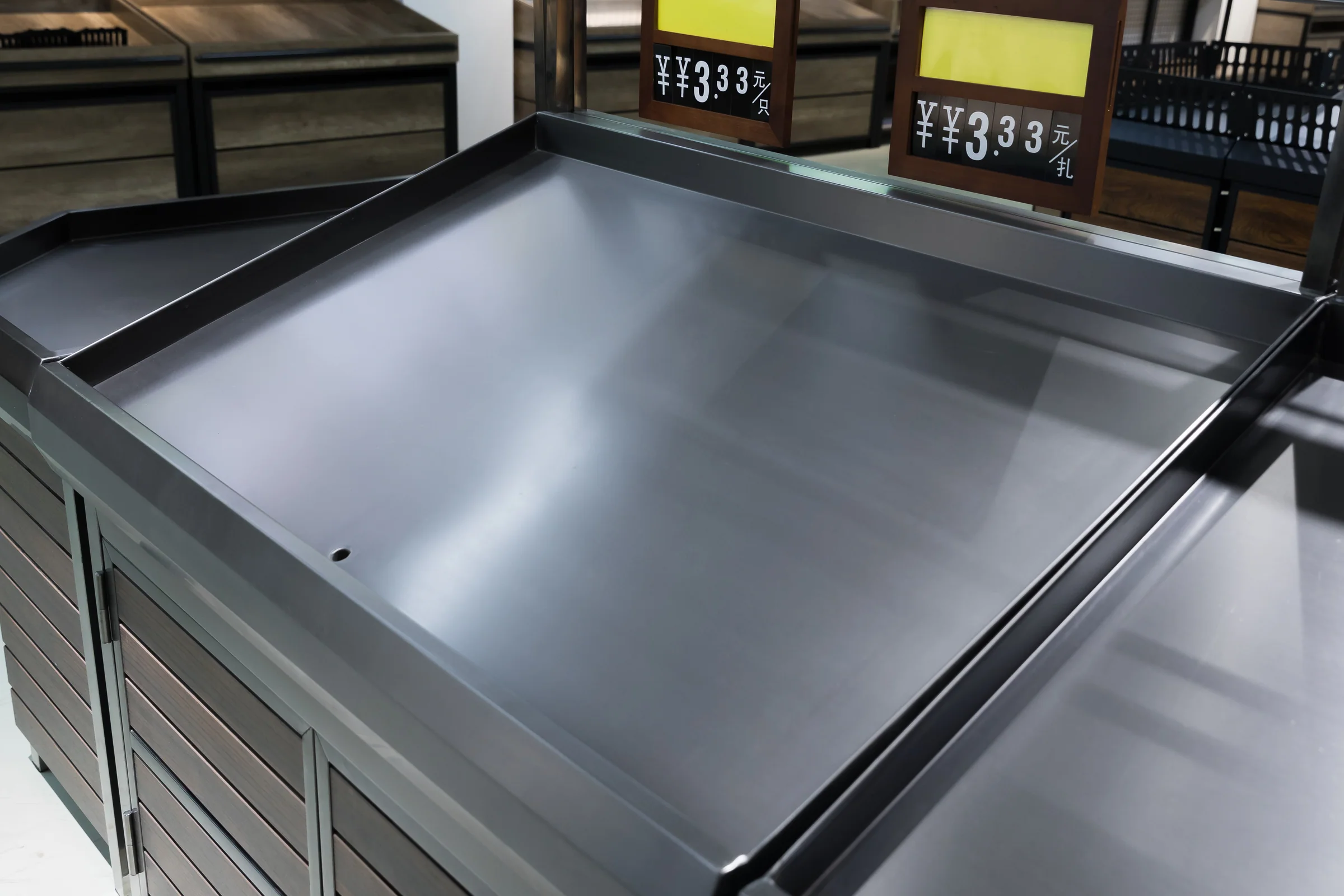
Rich brown timber · black deck · sign posts
The warmest timber tone in this category, with a black deck and sign posts above. It is specified by stores that want the produce department to feel like a market hall rather than a supermarket aisle.
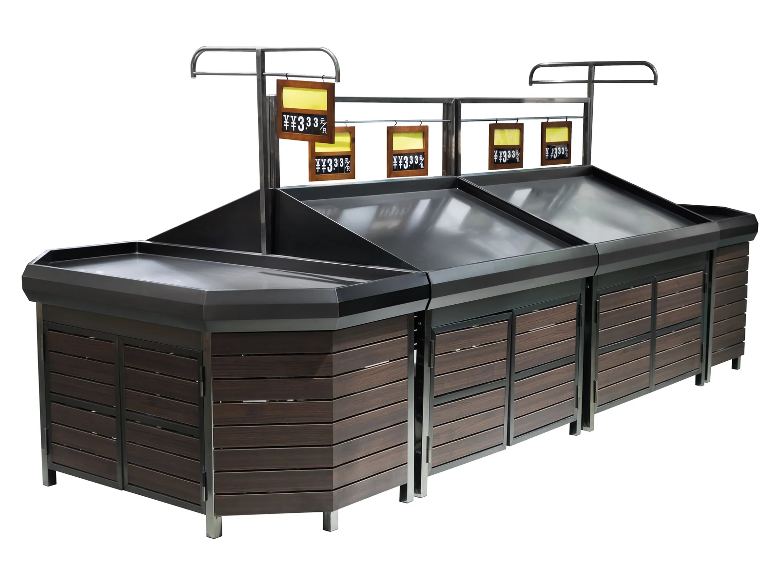
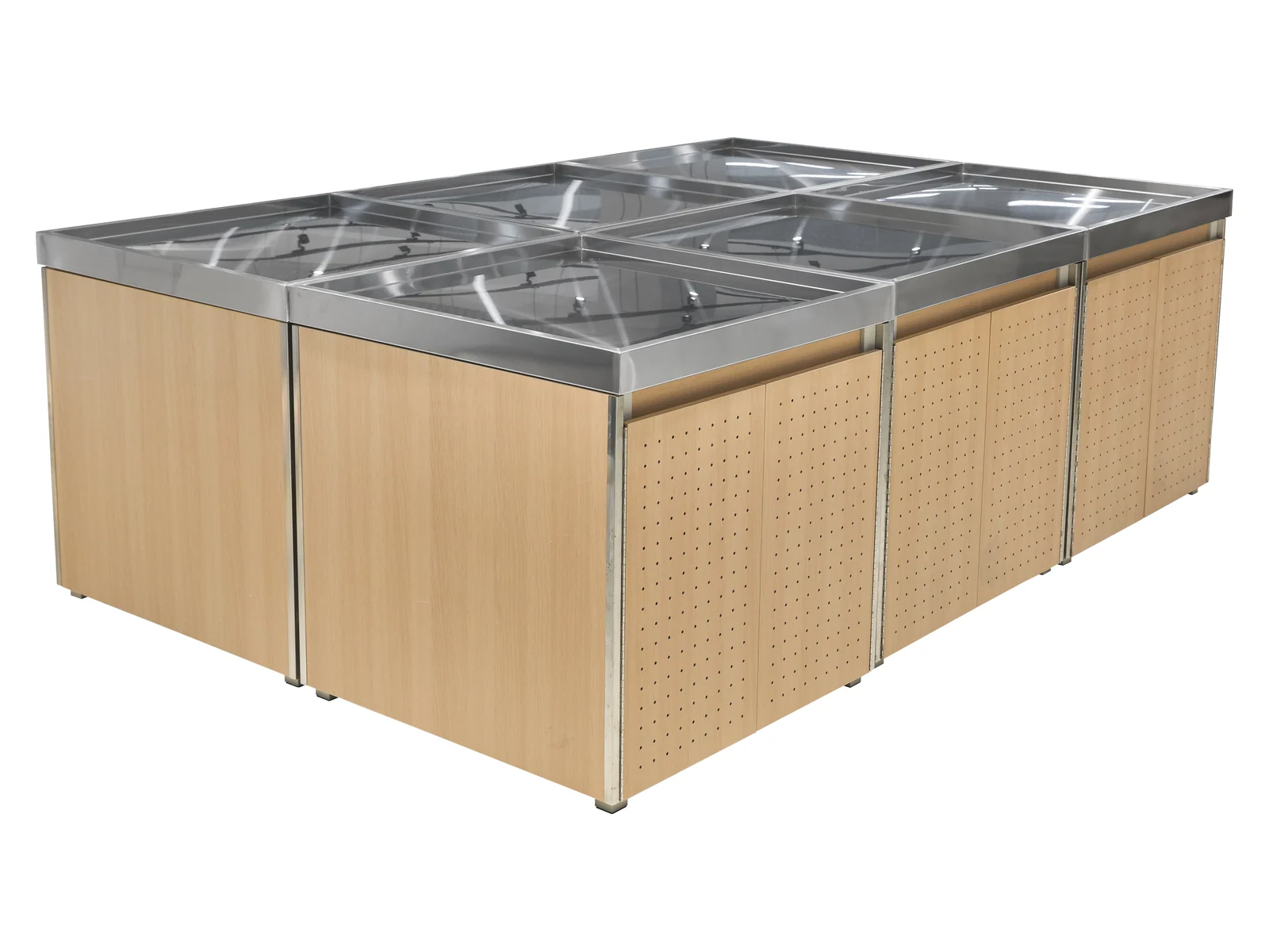
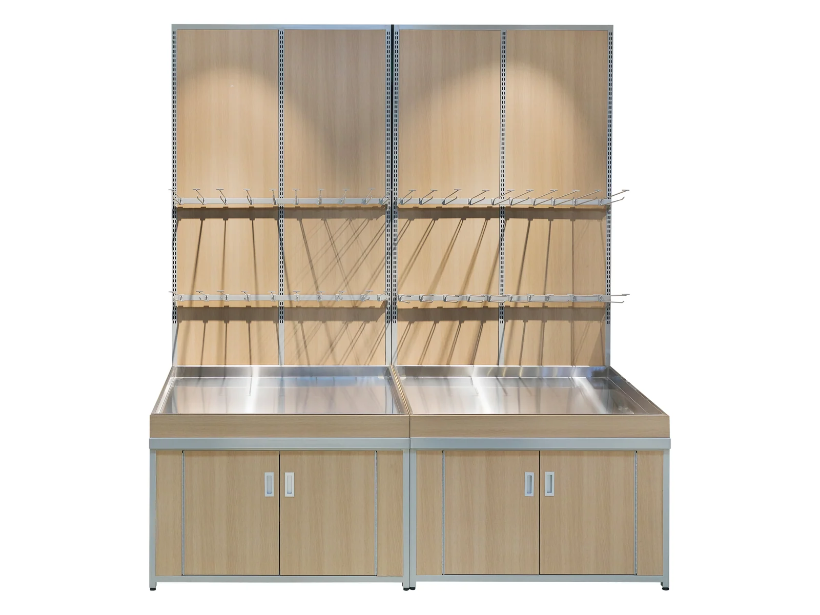
Studio angles on white. The timber grain, the black deck edge, the sign post and the angled end are photographed below.
Produce fixtures in this category run from pale to dark, and this is the one at the warm end — a rich brown board with visible grain, against a black deck and black frame. The contrast is what does the work: a warm body under a black deck reads as a market stall, where the same body under a pale deck would read as a shop fitting.
It carries sign posts above the deck and an angled end at the aisle head, so it works as the fixture that faces the main route through the store. Everything else follows the family: slatted panels for airflow, steel frame behind them, built in bays to whatever length the aisle needs.
The warmest timber tone in this category, with a black deck and sign posts above. It is specified by stores that want the produce department to feel like a market hall rather than a supermarket aisle.
Supermarkets, convenience stores, chain retail and speciality stores. Tell us the store format and the floor area and the specification comes back written against them.
This build is chosen on how it looks, so three of these four are the surfaces that decide that.
Paint-free wood grain board
Paint-free wood grain board with the grain clearly visible. It is generally density board or multi-layer board, safe and environmentally sound, and it is the warmest tone we hold for this category.
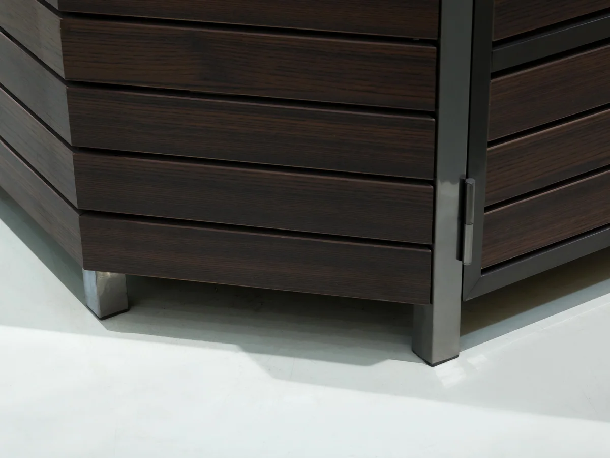
Contrast against the body
The black deck sits directly over the warm timber. That contrast is the whole look: it frames every crate on the deck and it stops a warm fixture reading as one soft brown mass.
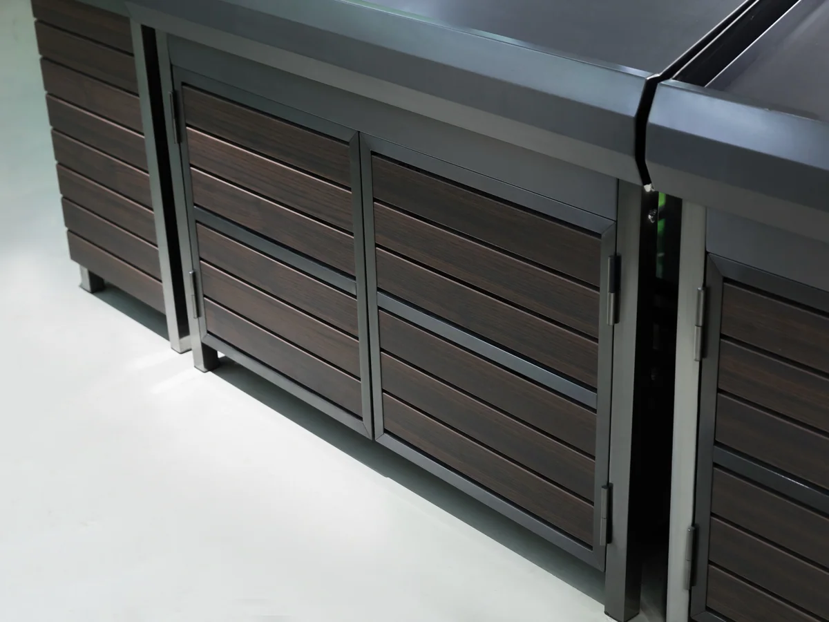
Rises from the island
The posts come out of the island rather than the floor, so nothing extra stands in the walking space and the signage moves with the fixture when the department is re-laid.
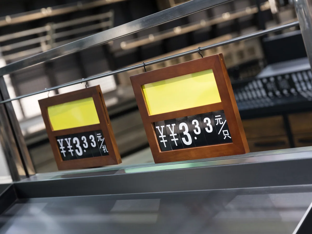
Opens the approach
The end is cut at an angle so the aisle entrance opens rather than narrows. It is the same decision as on the other aisle-head builds here, and it is the one that survives the most trolley traffic.
Every item on this page is made to order. Send a floor plan, a hand sketch or a photograph of a fixture you like, and we quote against it.
Store fixtures are light for their size, so a container fills up on volume long before it fills up on weight. What decides your freight is not what one unit weighs — it is what shape the goods are in when they go through the container door. Everything we build leaves in one of three shapes.
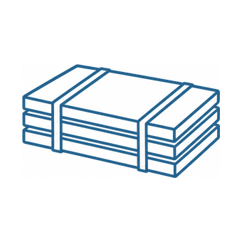
Shelving bays, produce islands and bulk cabinets travel as panels — uprights, shelves, back panels and plinths, strapped flat with bubble wrap on every component. They are built up on the shop floor, so the packing list and the assembly drawings travel with the goods.
This model
Trolleys slide into one another and baskets stack. Past the first unit, each extra one adds only its nesting pitch instead of its full length, so the shipped volume ends up a fraction of what the unit count suggests.

A checkout lane is welded, coated and fitted out as one piece, so it is crated whole with padding on the steel. Nothing waits to be assembled at the store beyond levelling it into the lane, and the crate is the counter plus a margin.
Produce islands ship flat as panels, so the container arithmetic runs on panel count rather than on finished size. Two of the builds in this category carry recorded dimensions — 1200 × 750 × 850 mm for the standard island table and 1200 × 800 × 1300 mm for the tall build — and those two are the reference points a loading plan is worked from. Everything else is cut to your aisle and confirmed on the packing list.
Produce is the wettest, heaviest and fastest turning department in the store, and it rarely arrives on its own. These three categories share the fresh aisle with it.
Where the produce run meets the fish counter, both fixtures want stainless at the contact surfaces and a drain in the same floor.
See seafood display casesLoose dry goods sit alongside loose produce in most store plans, and the two departments are read by shoppers as one open market area.
See bulk food binsProduce is promoted harder than any other department, and a 1000 mm square at the head of the aisle is how a glut gets moved.
See promotional standsHow many of each a store needs is a floor area question rather than a product question, and it is answered store by store on the supermarket layout design page.
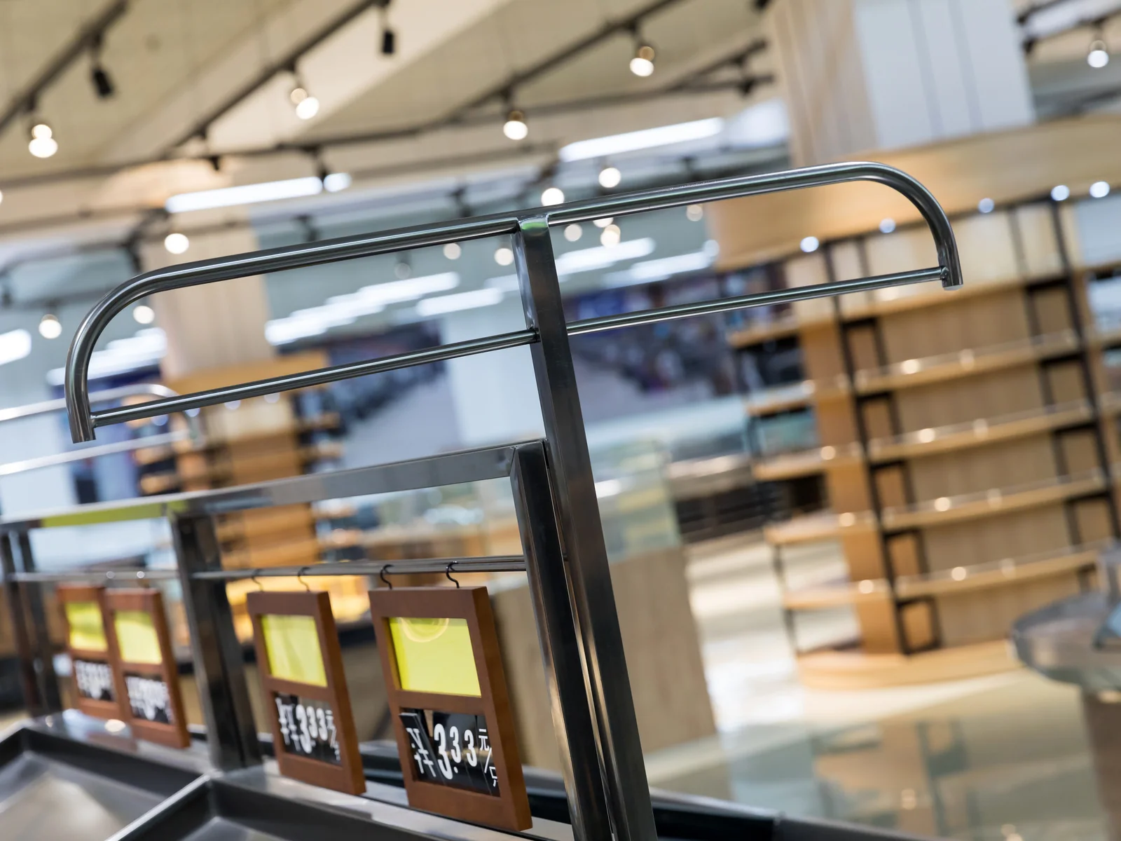
This is the market-hall look. Send your aisle length and we will draw the run.
Send the aisle length and tell us what tone the fixtures around it are. A warm island next to cold grey shelving fights rather than works, and that is worth catching on the drawing.
The four that come up on nearly every enquiry for this build. If yours is not here, send it with your layout and it is answered alongside the quotation.
Tone rather than structure. This one is a warm brown against black; the other is a cool dark slat. In a store lit warm the brown comes alive and the cool dark goes flat, and under cool lighting it is the other way round.
Yes, and the board tone and frame colour are specified separately. Any RAL or PANTONE reference on the steel, held across every category on the order.
Less than a pale board and more than a black one. Everything is plastic powder coated and protected against damp, but the honest position is that a mid-brown sits in the middle for marking as well as for tone.
Yes. The posts are specified rather than integral, and a store already running ceiling signage usually leaves them off — two layers of signage over one fixture is one too many.