Red Moulded Body
Most visible colour
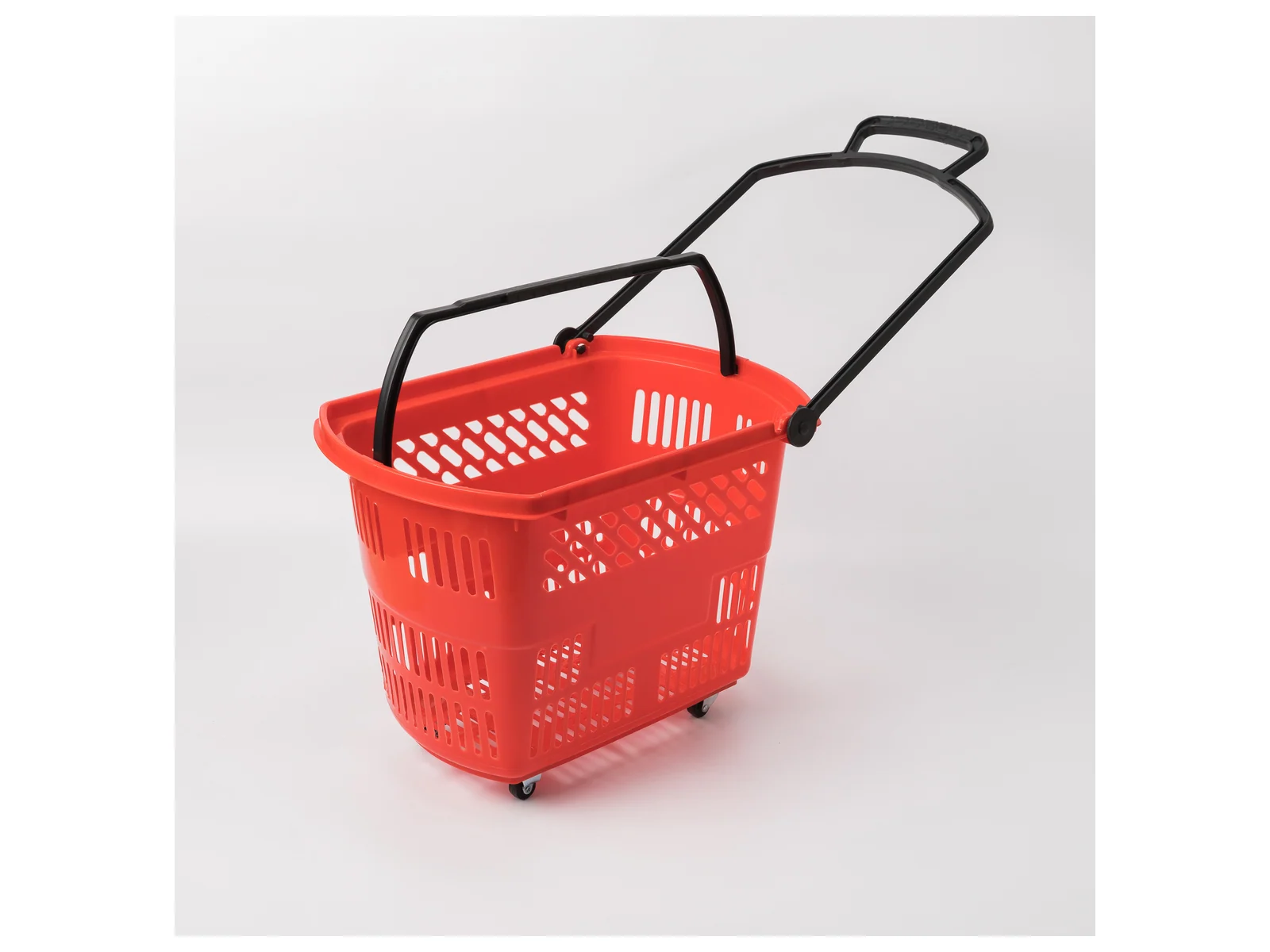
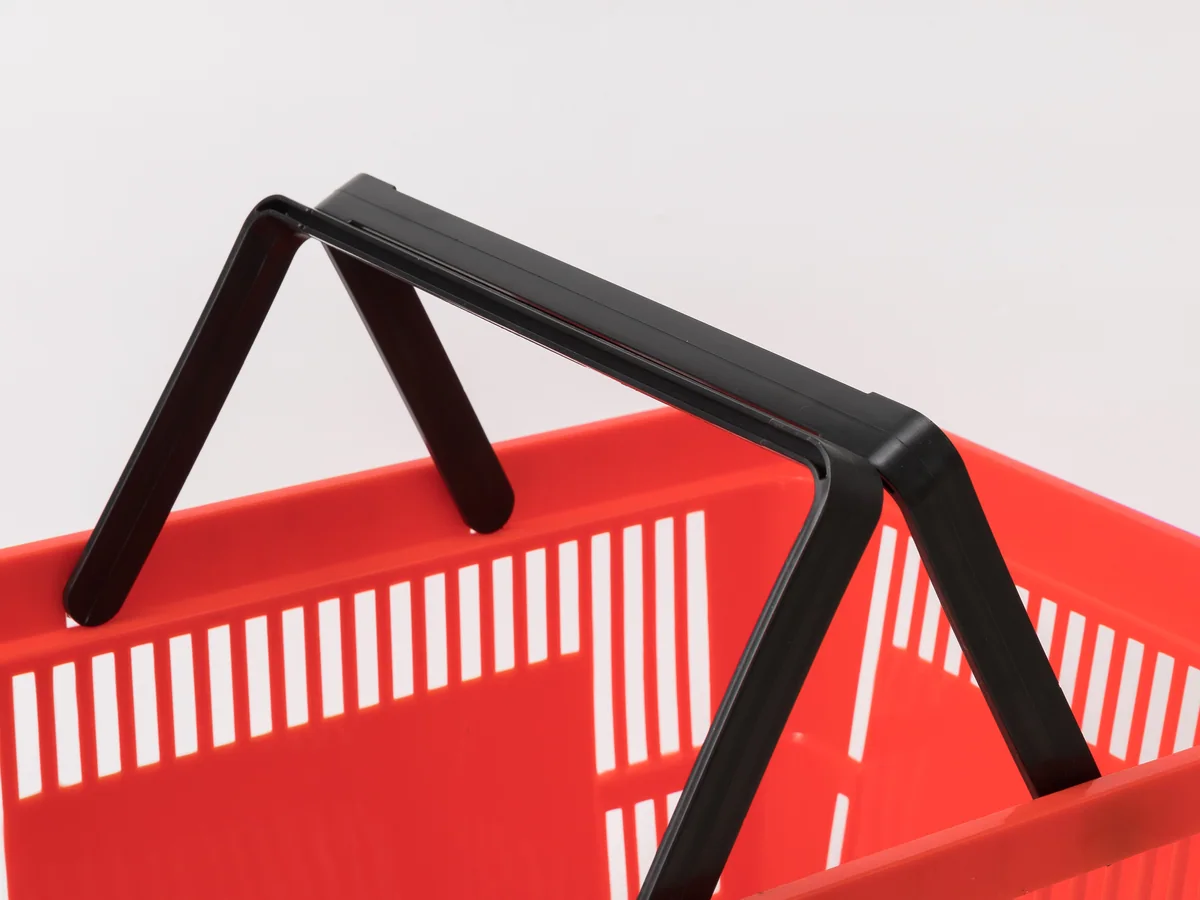
Red moulded through the material. It is the most visible basket we make at an entrance, and it is a strong enough statement that it needs the rest of the store to have been chosen alongside it.
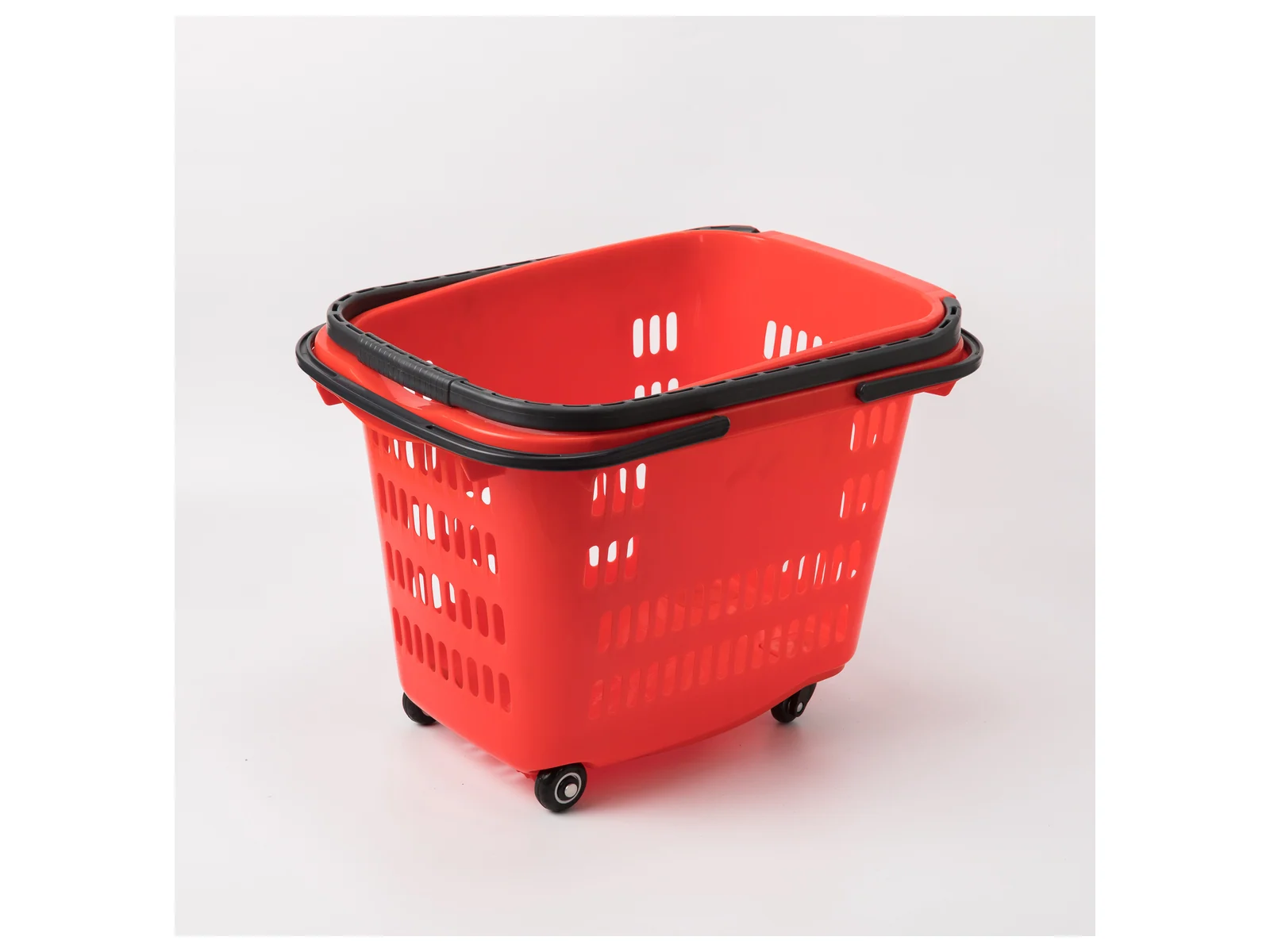
Moulded red · highly visible · twin folding handles
The twin-handle hand basket in red. It is the most visible colour we make, which matters more at the entrance than anywhere else in the store.
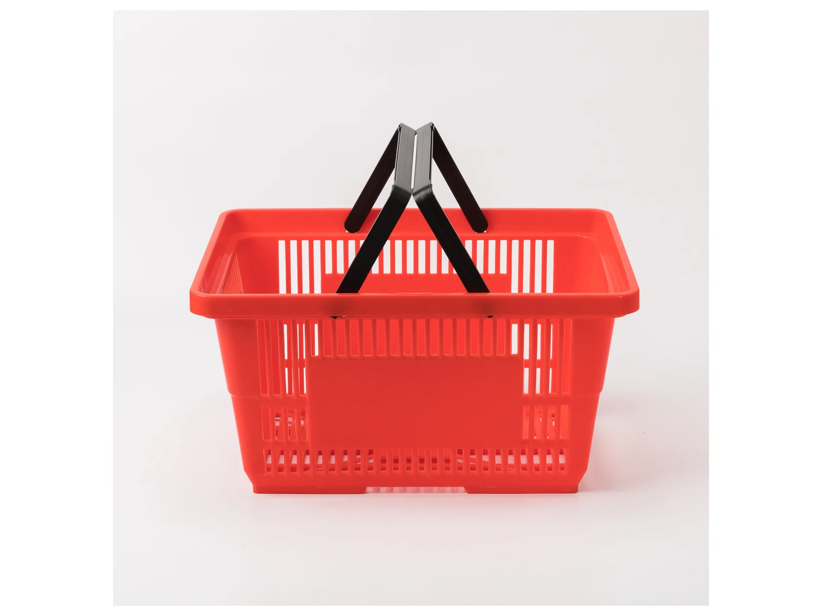
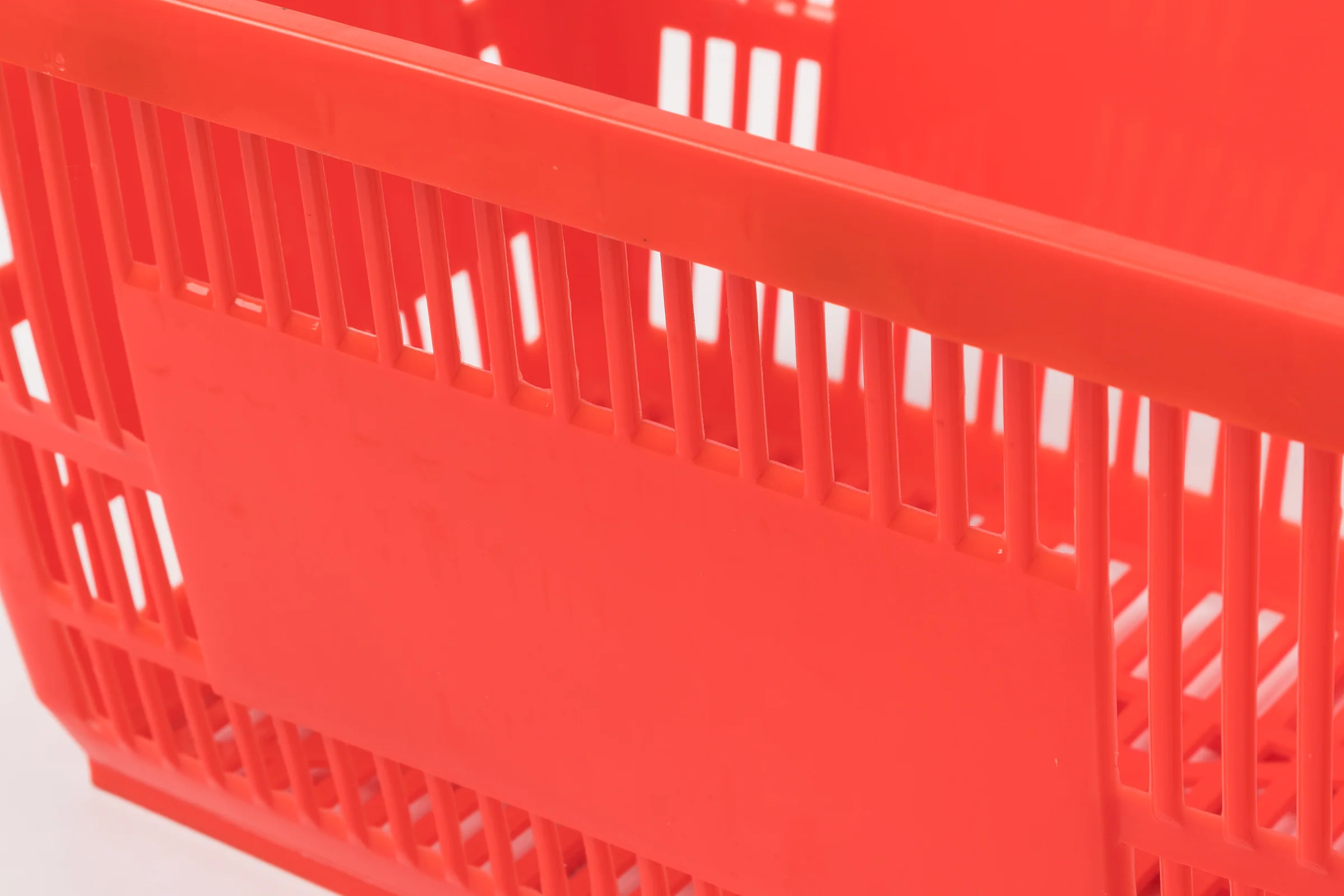
Studio angles on white, with close-ups below.
The basket stack has one job before a shopper reaches it: to be noticed. A shopper who walks past the stack without registering it carries their items by hand and buys fewer of them, and that is a loss no merchandising further into the store recovers. Red is the most visible colour we make.
There is a cost to it. A red basket fleet is a strong colour statement that will fight with your fixtures if they were not chosen alongside it, so it works best in stores where red is already part of the identity rather than as a standalone decision.
The twin-handle hand basket in red. It is the most visible colour we make, which matters more at the entrance than anywhere else in the store.
Supermarkets, convenience stores, chain retail and speciality stores. Tell us the store format and the floor area and the specification comes back written against them.
Red is chosen for one reason and carries one risk. These four are both.
Most visible colour
Red moulded through the material. It is the most visible basket we make at an entrance, and it is a strong enough statement that it needs the rest of the store to have been chosen alongside it.
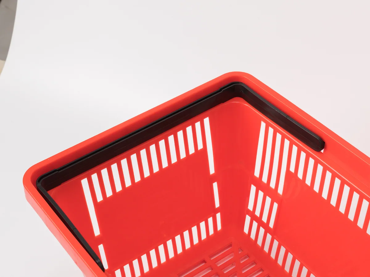
Forty at once
A basket is one object; a stack of forty is a block of colour roughly a metre square. That is the thing to picture when choosing red, not the single basket in a photograph.
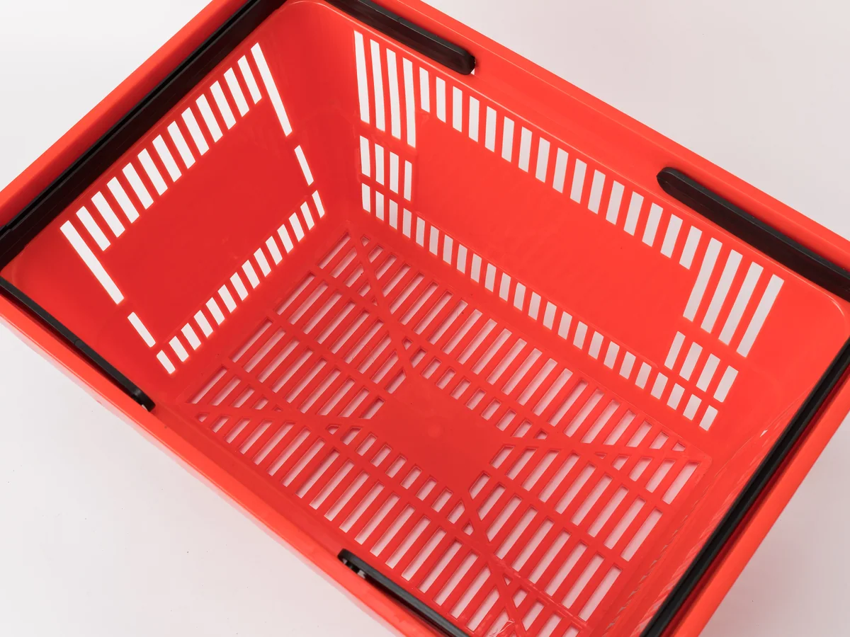
Contrast or match
Handles in a contrasting tone break up the mass of colour; matching handles intensify it. On red that decision changes the entrance more than it does on any other colour here.
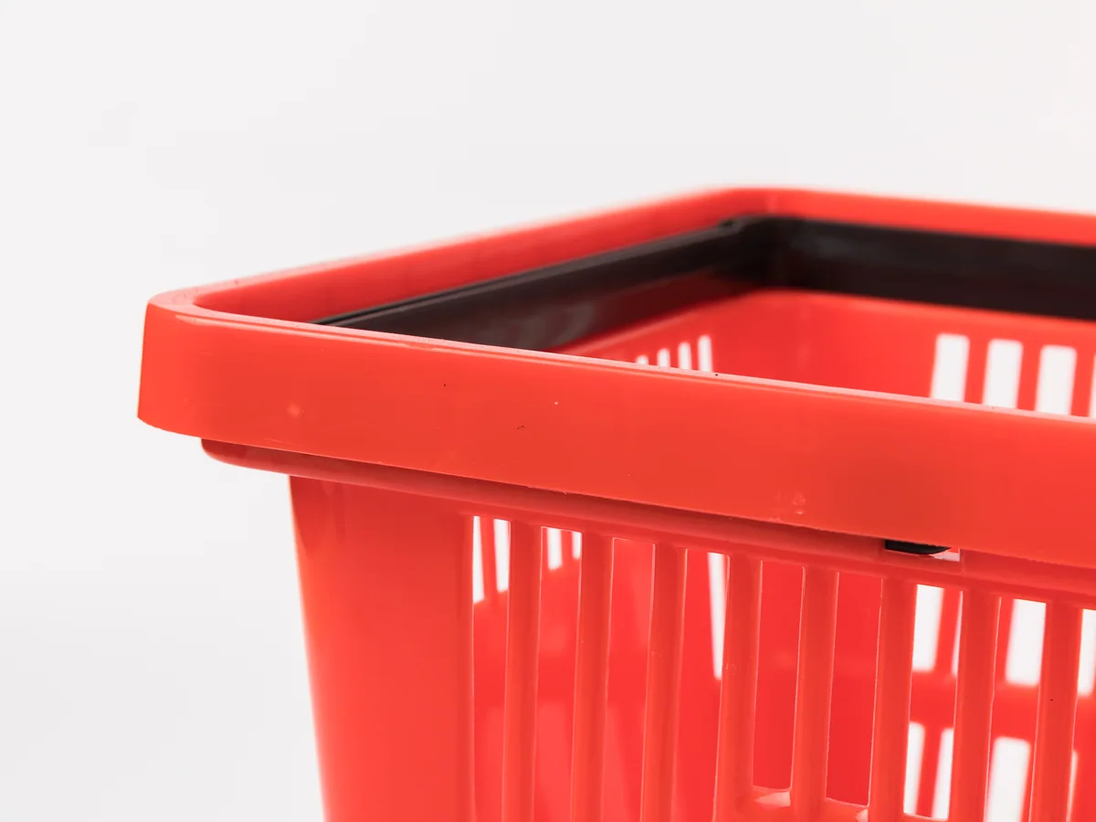
Shifts with the light
Red shifts more than any other colour under different retail lighting, reading warm under halogen and flat under cool LED. It is worth checking a sample under your own lighting before ordering several hundred.
Every item on this page is made to order. Send a floor plan, a hand sketch or a photograph of a fixture you like, and we quote against it.
Store fixtures are light for their size, so a container fills up on volume long before it fills up on weight. What decides your freight is not what one unit weighs — it is what shape the goods are in when they go through the container door. Everything we build leaves in one of three shapes.
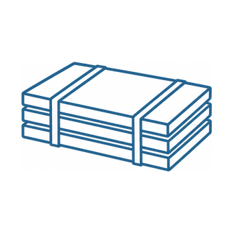
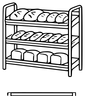
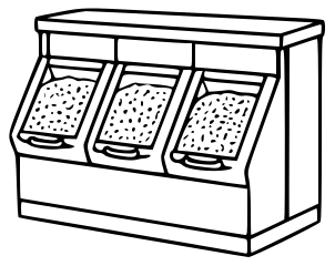
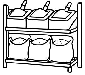
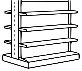
Shelving bays, produce islands and bulk cabinets travel as panels — uprights, shelves, back panels and plinths, strapped flat with bubble wrap on every component. They are built up on the shop floor, so the packing list and the assembly drawings travel with the goods.
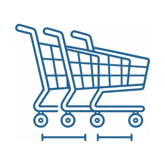
Trolleys slide into one another and baskets stack. Past the first unit, each extra one adds only its nesting pitch instead of its full length, so the shipped volume ends up a fraction of what the unit count suggests.
This model
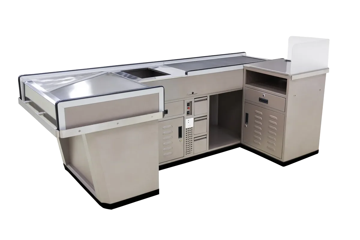
A checkout lane is welded, coated and fitted out as one piece, so it is crated whole with padding on the steel. Nothing waits to be assembled at the store beyond levelling it into the lane, and the crate is the counter plus a margin.
Baskets stack, which makes them the densest thing we ship. A column of nested baskets is close to solid plastic, so the freight cost per basket is a fraction of anything else in this catalogue — which is why baskets are almost always added to a container that is going anyway rather than shipped on their own. We do not publish litre capacities for this range. The figures circulating for it came from an old third-party listing rather than from our own production records, and they are being confirmed with the factory first.
A trolley bay is part of the front of store, and what it stands next to decides how well it works.
The lane length has to leave room for a loaded trolley to turn out of it, which is a dimension worth checking before either is ordered.
See checkout countersAisle width is set by two loaded trolleys passing, so the shelving depth and the trolley size are one decision rather than two.
See shelving baysA promotion square at an aisle head is the first thing a trolley has to get past, and the clearance between them is worth drawing.
See promotional display tablesHow many of each a store needs is a floor area question rather than a product question, and it is answered store by store on the store layout planning page.
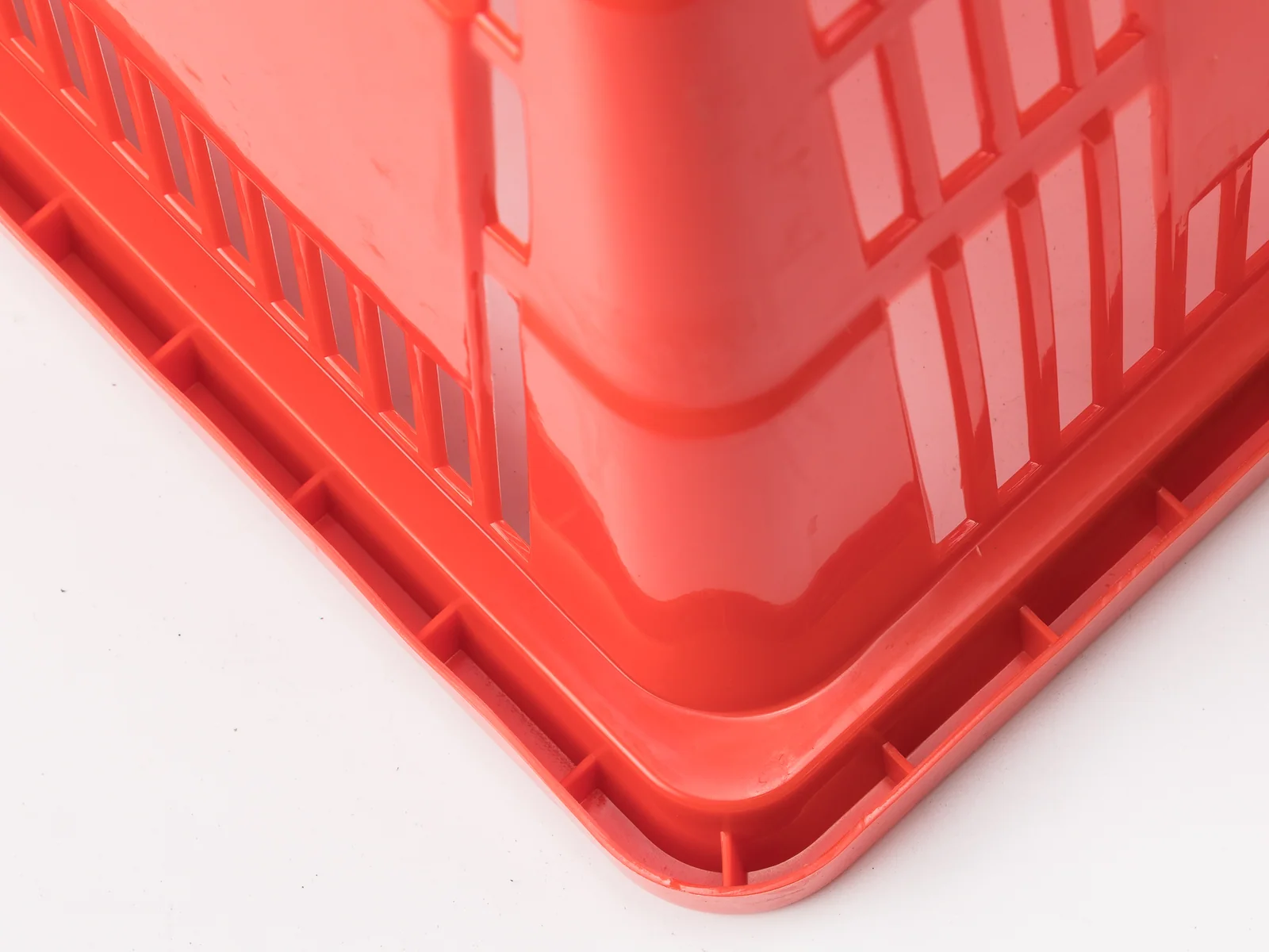
Picture forty of them stacked, not one in a photograph. That is what you are buying.
Before ordering, picture a stack of forty rather than a single basket — that is a block of colour about a metre square at your entrance. Ask for a sample under your own lighting; red shifts more than any other colour.
The four that come up on nearly every enquiry for this build. If yours is not here, send it with your layout and it is answered alongside the quotation.
It might, and that is worth checking before ordering several hundred. Red works where it is already part of the store identity; as a standalone choice against neutral fixtures it can end up being the loudest thing in the room.
More than any other colour here. It reads warm under halogen and flatter under cool LED, so ask for a sample and look at it in your own entrance before committing.
Contrasting handles break up the mass of colour; matching handles intensify it. On red that decision changes the entrance more than it does on any other colour in this range.
If shoppers are walking past your basket stack, yes — that is a loss nothing downstream recovers. If they already pick baskets up reliably, visibility is a problem you do not have and a quieter colour is the better choice.