

In a retail environment, how fresh a shopper believes something is will often move the sale before actual shelf life does. That belief is not an accident. It is assembled out of sightlines, light, the route people walk, how full a shelf looks and what the fixture is made of — and every one of those is a shelf planning decision, settled long before the first pallet arrives. Getting them right is a matter of consumer psychology, visual merchandising and retail science working on the same piece of floor.
Key takeaways
- Put perishables in the band a shopper reaches without effort, roughly 120 to 160 cm, and keep the fixtures around them low enough to see across.
- A fresh zone reads as fresh when it is full but not crammed. Holding a single category to around 60 to 70 per cent of shelf capacity and rotating stock forward is the working figure.
- Light does more for perceived freshness than any other single change. Neutral light of about 4000 K with a colour rendering index above 90 shows food as it actually is.
Height Is The First Freshness Decision
Spatial layout should start from the golden eye level: the band between roughly 120 and 160 cm that a standing shopper takes in and reaches without thinking. Perishable goods belong there, and within that band a pyramid-style structure works best, with the shortest-dated goods in the most prominent position so they move first. Put those two rules together and the fresh section stops needing signage to explain itself.
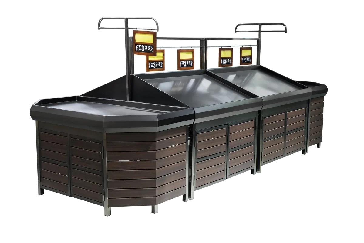
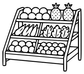
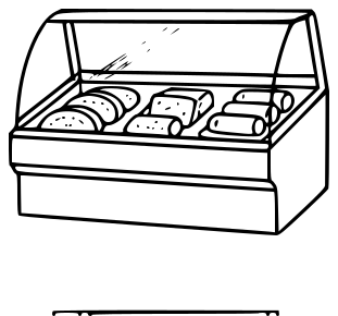
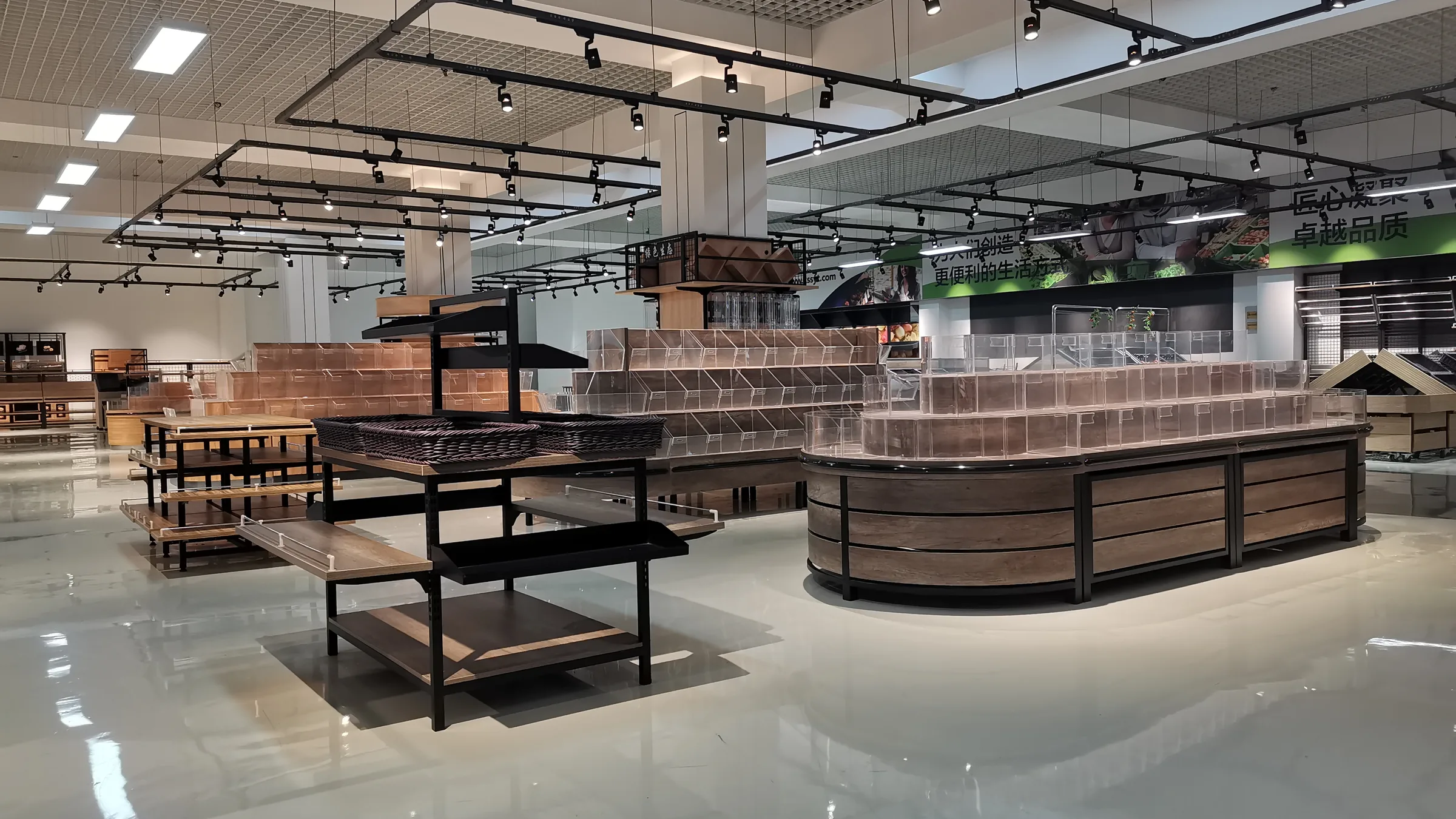
The fixtures around that band matter as much as the band itself. In fresh produce, fruit and vegetables and bakery, low shelving — typically below 1.2 to 1.4 m — or island display tables should come first. A low, open section creates a spacious visual effect: a customer walking in sees a large quantity of fresh product at once, which reads as abundance and, indirectly, as turnover. There is a practical dividend too. A broad view reduces the anxiety of hunting for something, and low open fixtures allow better air circulation, which genuinely matters for goods that need it.
This is exactly why our own fruit and vegetable racks come in two heights from the same range rather than one.
| What it is | Figure | Why it is set there |
|---|---|---|
| Golden eye level | 120 – 160 cm | The band a standing shopper sees and reaches without effort. Perishables go here |
| Low shelving in fresh, produce and bakery | Below 1.2 – 1.4 m | Keeps a view across the section and lets air move around the goods |
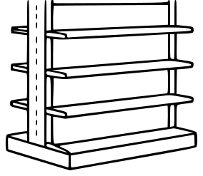
| Keshun island, double sided, per group | L1000 × W800 × H1500 mm | Stands in the open floor, so it is held down to protect the sightline |
| Keshun wall run, single sided, per group | L1000 × W400 × H1700 mm | Blocks nothing behind it, so the same range can go 200 mm taller |
Light Does More Than Any Other Single Change
The most important fresh products — seafood delivered the same day, bread out of the oven — are worth treating like something on a stage. Spotlights, a backdrop in a natural material such as wood grain or stone, and a small amount of dressing will lift them out of the general run of the aisle. The lighting specification behind that is narrow: neutral light with a colour temperature of around 4000 K and a colour rendering index above 90.
Those two numbers do the work. Properly cool light makes green leaf vegetables greener and meat redder; warmer light makes baked goods golden and appetising. High colour rendering matters because it restores the true colour of food — and distorted light is one of the few things that will make genuinely fresh produce look stale. The related mistake is running one static lighting scene all day, when the section is serving completely different shoppers at eight in the morning and at seven in the evening. A dimming system that changes with the day is the more scientific answer.
Where The Fresh Zone Sits On The Walking Route
Space planning also governs how fast goods actually turn over, which is the foundation under all of this: real freshness first, perceived freshness second. Departments that are high frequency and best embody freshness — fresh produce, fruit and vegetables, flowers — belong at the entrance to the customer’s active path or on a route they cannot avoid. Those departments are vividly coloured and busy, and seeing them first sets the tone for the whole store.
The reason is the primacy effect: people are most influenced by the information they receive first, so a strong opening impression creates a positive bias that carries into how everything afterwards is judged. The same logic supports bringing back-of-house work forward. A glass window or an open work area that lets customers watch fish being cut, bread being baked or produce being packed produces visible evidence of on-site preparation, and that is far more convincing than any label claiming it.
Freshness management has been moving from physical preservation towards psychological perception. The shelf is where that shift actually happens.
Full, But Not Crammed
Core fresh lines such as apples and oranges reward a large, stacked display. What makes it work is not the volume but the discipline: the display area has to stay full and neat, the goods have to be tidied promptly, and anything that has stopped looking its best has to come out. A full display implies high sales and quick replenishment, and shoppers read it that way without being told. Gaps and disorder say the opposite — slow-moving stock and picked-over goods — and they say it immediately.
The counter-intuitive part is that more is not better. Excessive display works against you, and the working figure is to hold a single category to around 60 to 70 per cent of the shelf capacity while regularly rotating stock forward. A shelf at that fill level looks tended rather than dumped. The other common own goal is covering a refrigerated cabinet with promotional posters, which blocks the one thing the cabinet exists to do.
Time information belongs on the shelf as well. A unified, clear labelling system is the most direct promise of freshness there is: electronic tags that display production date, on-shelf time or best-before date, backed by simple colour management — one tag colour for goods of the day, another for regular lines. Clear information reduces the uncertainty in a purchase decision, which is what actually makes someone reach for a package.
Materials And Colour That Read As Fresh
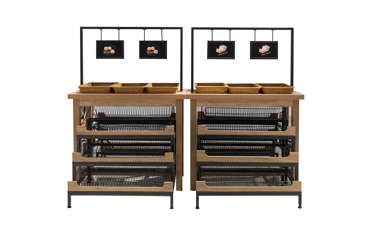
The environment around a display is the backdrop the shopper judges it against. Colours associated with freshness and nature — mint green, light blue, wood tones — work as the main scheme for shelves, display tables and walls, because green and blue are strongly linked with freshness, health and cleanliness. Wood grain in the bakery section does something more specific: it reinforces the suggestion that what is on the shelf was baked here and is being sold here.
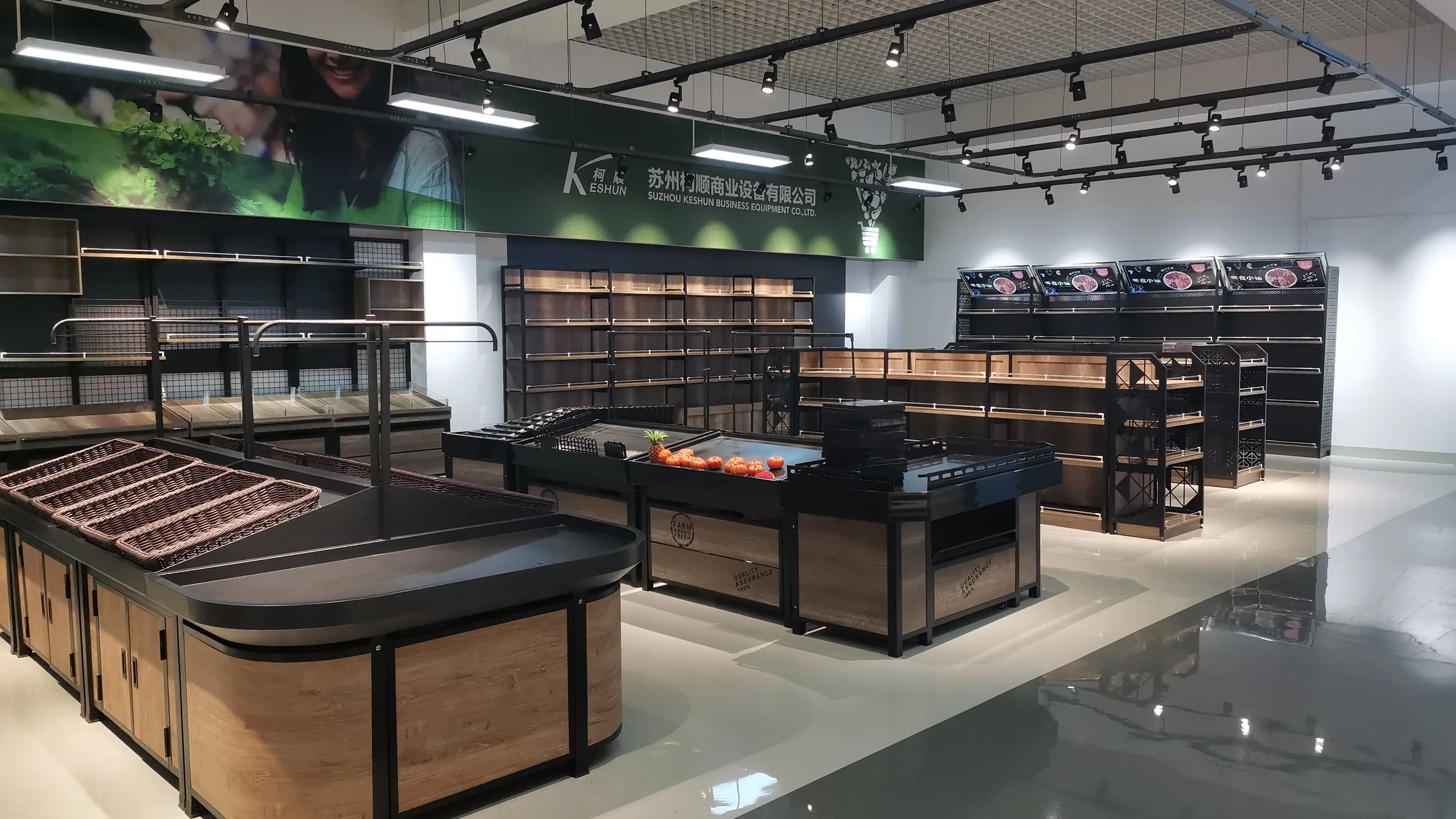
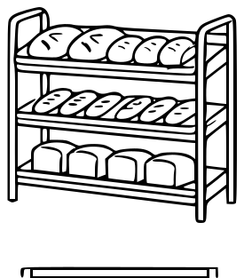
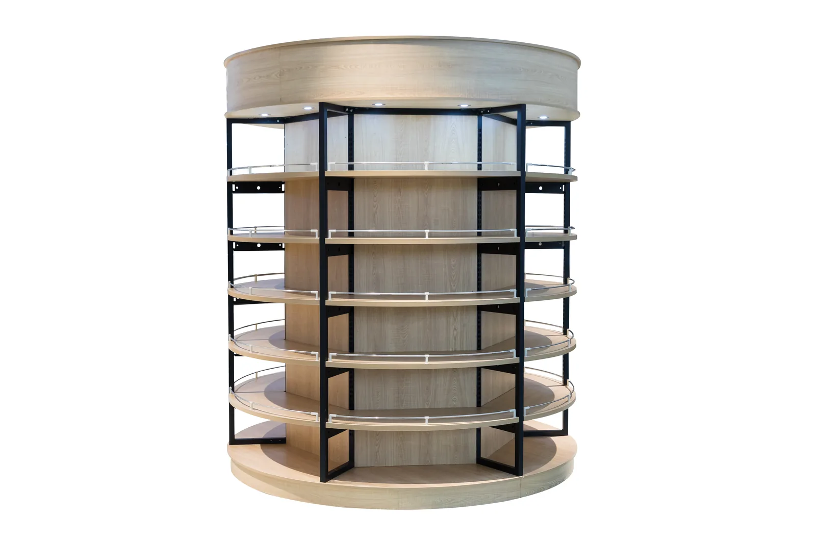
Natural materials carry the same message physically. Wooden shelving, stone countertops and rattan baskets all point back towards origin, which is why they keep appearing in fresh sections that are trying to look like markets. That vocabulary is available in the standard range rather than only as a special: our fresh rack family includes frame rattan basket displays alongside the steel and wood units, and the wooden racks are built from cedar or pine board. Because steel and wood shelving, produce racks and bread display racks are all produced in the same plant, one wood tone can be held across a whole fresh zone instead of being approximated by three suppliers.
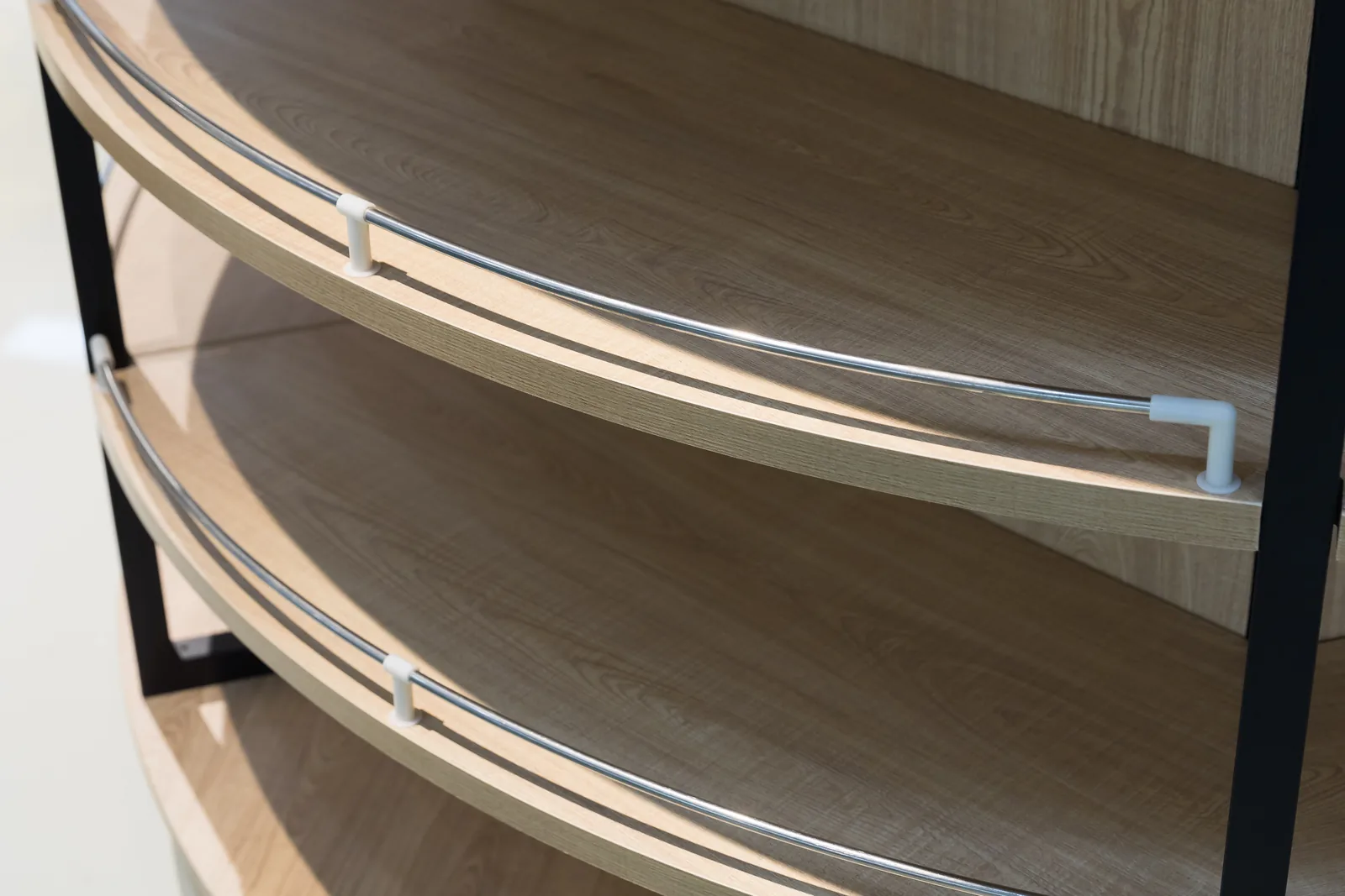
What one plant lets you hold across a fresh zone
Steel fabrication, woodworking and stainless steel production all run on the same site in Changshu, so one colour, one wood tone and one surface grade can be carried across produce islands, wall runs, bakery racks and the shelving behind them on a single order. The finish standard is described on our About page.
The Housekeeping That Undoes All Of It
Cleanliness is the precondition for freshness, not a detail alongside it. Shelves, display tables and floors have to be kept absolutely clean, with water stains, dirt and scattered merchandise cleared as they appear, and the glass doors of cold chain equipment kept transparent and free of heavy condensation. A dirty environment will directly undermine every other piece of freshness marketing in the section, because it raises a question about safety and quality that no amount of lighting will answer.
Where there is room to go further, the senses beyond sight are worth using. Letting shoppers feel the texture of fruit or the crust of a loaf, guiding the smell of the bakery or the coffee counter into the right area with directional air, and keeping the background sound gentle all raise the sense of being somewhere real. Multi-sensory experience is what turns freshness from a claim into something a customer can register directly — which is, in the end, the whole purpose of planning the space this carefully.
Keshun Technical Team. First published 1 August 2025, rewritten 6 August 2026 from two earlier articles on shelf design and the perception of freshness. Product dimensions are from our current records.