Every department store and supermarket has a checkout counter, and most of them treat it as a place where money changes hands. It is also the only position in the building where a customer stands still, facing a fixed surface, with nothing else to do. A little thought about what is on that surface returns more per square metre than almost anything else a store can change.
Key takeaways
- The counter is the only place a shopper is stationary and facing a display. Treat the tiers as selling space, not trim.
- Anticipating what people forget works as well as impulse merchandising, and annoys them less.
- It is also the one place where staff and customers talk, which is where a store learns what its customers actually want.
Impulse Purchases Are The Obvious Part
Read the buying habits of your customers and the counter position becomes obvious. Place the merchandise most often bought on impulse there and it lifts sales — small, attractive items that spark attention while somebody is waiting. Those customers buy the item even without weighing up whether they need it, because the purchase is small and immediate.
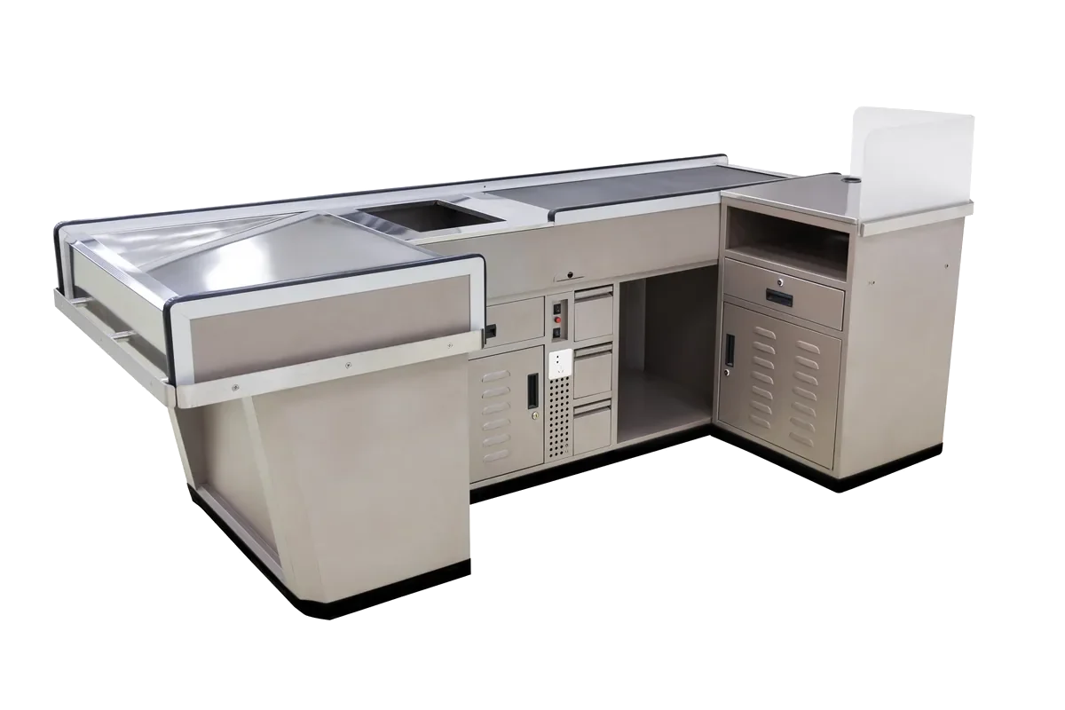
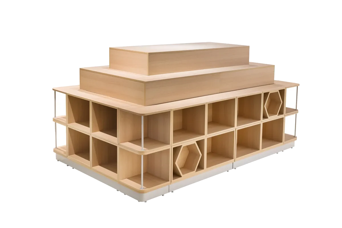
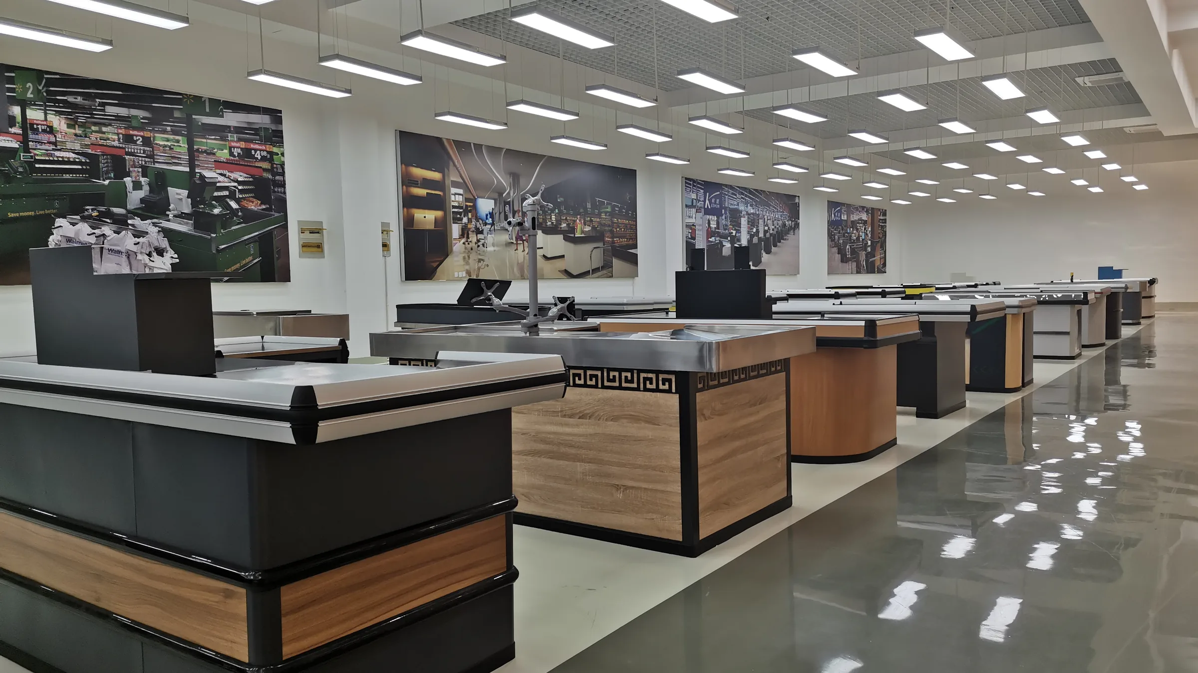
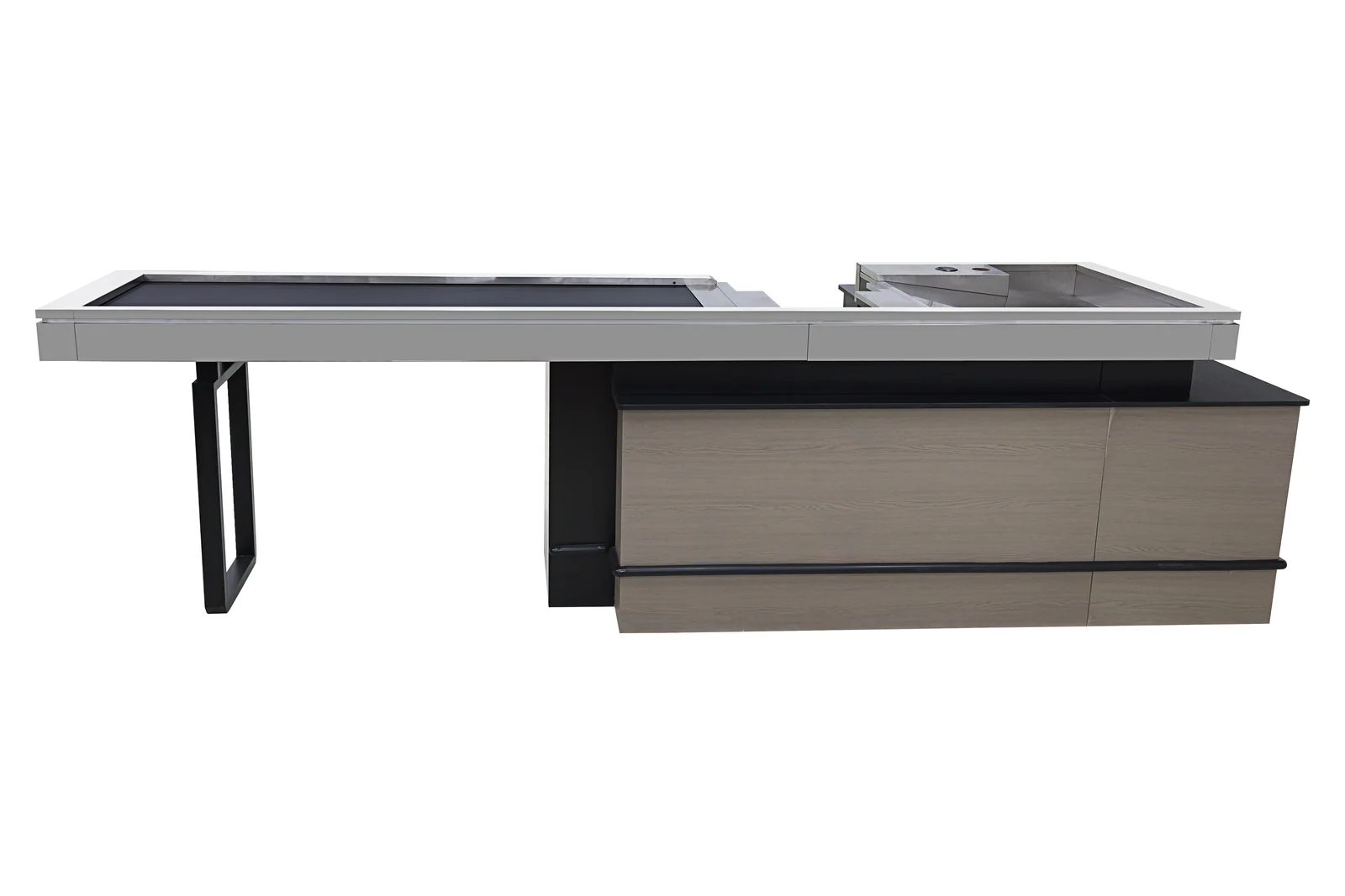
The practical consequence for the fixture is that the tiers facing the queue are part of the specification, not part of the shopfitting budget afterwards. Ask how many tiers a counter carries on the customer side and how deep they are, and treat the answer as part of the price comparison. A counter with four shallow tiers facing the queue is a materially different product from a plain box, even if both are 2000 mm long.
Anticipate What People Forget
Even without leaning on impulse, the counter can be made useful and still push the basket up. Think about what your customers might not have written down but do need. Depending on your average bill, there are always items that would be useful and that people routinely forget, and putting those on the counter reminds them at exactly the moment they can still act on it.
This is the better half of counter merchandising, because it is a service rather than a trick. The customer is glad to have been reminded, and the store gets the sale. It also ages better: a counter stacked with things people are pleased to be reminded of stays effective, while a counter stacked purely with sweets eventually reads as cynical.
The counter is the only fixture in the store where the customer is standing still with nothing to do. Very few stores use that properly.
Design The Area, Not Just The Counter
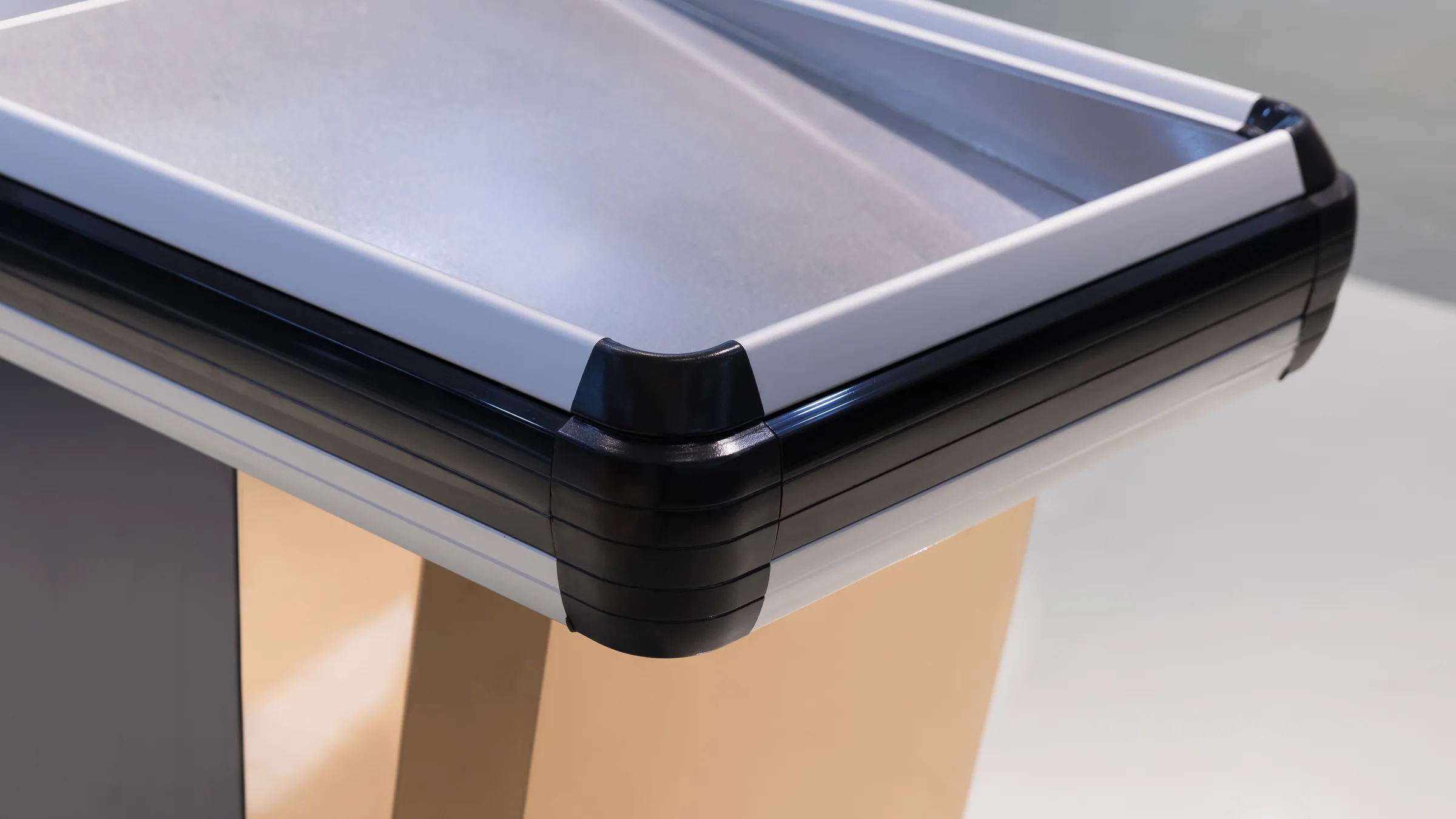
By the time a shopper reaches the counter they have used up some of their patience. Designing the checkout area thoughtfully and pleasantly helps to dispel that fatigue; a long queue at a badly-arranged counter does the opposite and sends people out mildly annoyed. This is why counter depth matters as much as counter length: a lane with somewhere to land a basket and somewhere to pack clears faster and feels calmer than a lane without.
Use The Conversation
The counter is also the one place in the store where a member of staff and a customer are face to face with a moment to spare. Marketing people can use that to take feedback and find out what customers actually expect from the shop, which occasionally results in a product being added that nobody would have thought of otherwise. Leaving room for that exchange — a counter not so cramped that the transaction has to be rushed — is a layout decision as much as a courtesy.
It is also where two specific offers work better than anywhere else. If a customer is close to a threshold that earns them a gift or a discount, the counter is where suggesting one more item is welcome rather than pushy. And it is the natural place to offer a membership card: the customer feels looked after and the store gains a repeat visitor, which is worth considerably more than the transaction in front of you.
| Use | What it needs from the fixture |
|---|---|
| Impulse sales | Tiers on the shopper side, depth enough to hold a facing |
| Anticipated needs | Visible surface at eye level for the forgotten items |
| A calmer queue | Counter depth for landing and packing a full basket |
| Conversation and sign-ups | Enough room that the transaction is not rushed |
What is on record for this category
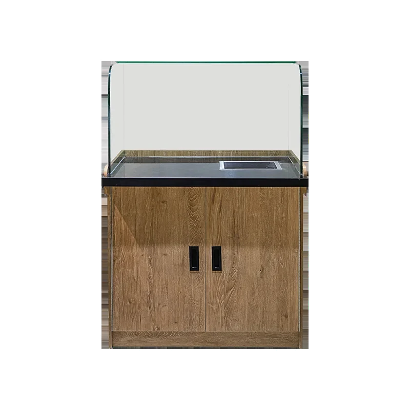
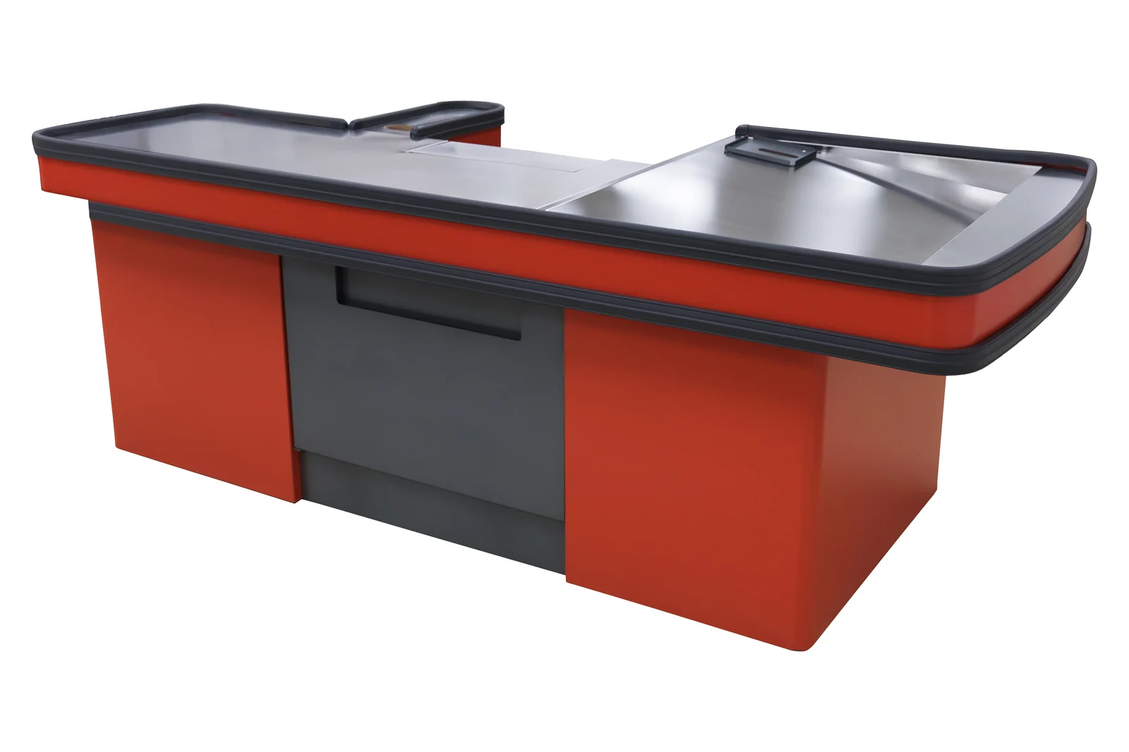
Seventeen checkout counter models. Recorded lengths 1200 to 2000 mm, recorded depths 600 to 1800 mm, every recorded worktop at 850 mm, with a 600 × 600 × 850 mm cashier stand module listed alongside nine of the thirteen dimensioned builds. See the checkout counter range.
Keshun Technical Team. First published 26 September 2018, rewritten 8 August 2026. The size figures quoted above are the ones on record for this category.